It’s normal to get bored. It’s normal to get frustrated. It’s normal to wake up one day next to your laptop, look at it, and not be able to imagine how you could spend another day analyzing fMRI data. It’s noisy, inconsiderate, and doesn’t care about your feelings. “Just give me a result!” you scream, pounding your fists against the screen. But it just sits there. Impassive.
Grown-ups like numbers. When you tell them about a new friend, they never ask: "What does his voice sound like?" "What games does he like best?" "Does he collect butterflies?" They ask: "How old is he?" "How many brothers does he have?" "How much does he weigh?" "How much does his father make?" Only then do they think they know him. If you tell grown-ups, "I saw a beautiful red brick house, with geraniums at the windows and doves on the roof..." they won't be able to imagine such a house. You have to tell them, "I saw a house worth a hundred thousand francs." Then they exclaim, "What a pretty house!"
--Saint-Exupery, The Little Prince
I often have vivid fantasies about how my talks will be received: The audience will laugh at my jokes; listen in attentive silence about the obstacles I overcame to carry out my research; gasp in astonishment as I reveal my big finding which will change the field forever. And, at the end of my talk - concluded with a germane and heartfelt anecdote which ties everything together - an ocean-like roar of applause and yells as I am lifted up high on a chair and carried through the streets with great honor. The men shake my hand vigorously and the ladies kiss me on the cheek. "Hats off, gentlemen!" says the town crier, "A genius!"
For some reason, and much to my dismay, reality fails to match my heart's desires. The jokes and asides feel flat and fall stillborn from my mouth. The background of my study feels less like an epic and more like reciting a laundry list. (I swear it sounded much more interesting when I was rehearsing it to myself.) Any small issue with the projector cutting out or with my Powerpoint animations failing to work, in the moment feels as embarrassing and indecent as being caught with my fly unzipped.
But I keep going nonetheless, holding out hope to someday achieve that perfect talk combined with the perfect moment. The ultimate trade awaiting the ultimate practitioner.
About forty years ago certain persons went up to Laputa, either upon business or diversion, and upon their return began to dislike the management of everything below, and fell into schemes of putting all arts, sciences, languages, and mechanics upon a new foot. To this end they procured a royal patent for erecting an Academy of Projectors in Lagado. Every room hath in it one or more projectors. The first man I saw had been eight years extracting sunbeams out of cucumbers.
--Swift: Gulliver's Travels, Part III, chs. 4-5
I'm updating my videos on fMRI basics, starting with ROI analysis. This is low-hanging fruit, yes, but delicious fruit, fruit packed with nutrients and sugars and vitamins and knowledge, fruit that will cure the scurvy of ignorance and halt the spreading gangrene of frustration.
In these videos you will observe a greater emphasis on illustration and analogy, two of the most effective ways to have concepts like ROI analysis take root inside your mind; to make them have a real, visceral presence when you think about them, and not to exist merely as words that happened to impinge on your retina. These videos take longer to make, but are all the more rewarding. And if they help you to think differently than you did before, if they help you, even without my knowing it, to see the world as I understand it, then I will have taken a significant step toward fulfilling my purpose here on this earth.
False positive rates in science have been an issue recently; and although we all had a good laugh when it happened to the social psychologists two years ago, now that it's happening to us, it's not so funny.
Anders Eklund and colleagues published a paper last summer showing that cluster correction - one method that FMRI researchers use to test whether their results are statistically significant or not - can lead to high false positive rates, or saying that a result is real, when actually it is a random occurrence that looks like a real result.
Their calculations showed that about 10% of FMRI studies are affected by this error (http://tinyurl.com/jaomsgs). However, keep in mind that even if a study is at risk for reporting a false positive, doesn't mean that their result is necessarily spurious. As with all results, one must go to the original study and take into account the rigor of the experimental design and whether the result looks legitimate.
These flaws have been addressed in recent versions of AFNI, an FMRI software package. The steps to use these updated programs can be found on the blog here: http://tinyurl.com/j5vafsb
Why did the old Folly end now, and no later? Why did the modern Wisdom begin now, and no sooner?
-Rabelais, Prologue to Book V
=======================
Academia, like our nation's morals, seems to be forever in peril. When I first heard of the replication crisis - about how standards are so loose that a scientist can't even replicate what he ate for breakfast three days ago, much less reproduce another scientist's experiment - I was reminded of my grandpa. He once complained to me that colleges today are fleshpots of hedonism and easy sex. Nonsense, I said. Each year literally tens of students graduate with their virtue intact.
One of my biggest peeves is complaints about how power analyses are too hard. I often hear things like "I don't have the time," or "I don't know how to use Matlab," or "I'm being held captive in the MRI control room by a deranged physicist who thinks he is taking orders from the Quench button."
Well, Mr. Whiny-Pants, it's time to stop making excuses - a new tool called NeuroPower lets you do power analyses quickly and easily, right from your web browser. The steps are simple: Upload a result from your pilot study, enter a few parameters - sample size, correction threshold, credit card number - and, if you listen closely, you can hear the electricity of the Internet go booyakasha as it finishes your power analysis. Also, if a few days later you notice some odd charges on your credit card statement, I know nothing about that.
The following video will help you use NeuroPower and will answer all of your questions about power analysis, including:
What is a power analysis?
Why should I do a power analysis?
Why shouldn't I do a power analysis on a full dataset I already collected?
How much money did you spend at Home Depot to set up the lighting for your videos?
What's up with the ducks? "Quack cocaine"? Seriously?
All this, and more, now in 1080p. Click the full screen button for the full report.
Jeanette Mumford, furious at the lack of accessible tutorials on neuroimaging statistics, has created her own Tumblr to distribute her knowledge to the masses.
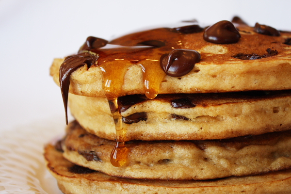
I find examples like these heartening; researchers and statisticians providing help to newcomers and veterans of all stripes. Listservs, while useful, often suffer from poorly worded questions, opaque responses, and overspecificity - the issues are individual, and so are the answers, which go together like highly specific shapes of toast in a specialized toaster.* Tutorials like Mumford's are more like pancake batter spread out over a griddle, covering a wide area and seeping into the drip pans of understanding, while being sprinkled with chocolate chips of insight, lightly buttered with good humor, and drizzled with the maple syrup of kindness.
I also find tutorials like these useful because - let's admit it - we're all slightly stupid when it comes to statistics. Have you ever tried explaining it to your dad, and ended up feeling like a fool? Clearly, we need all the help we can get. If you've ever had to doublecheck why, for example, a t-test works the way it does, or brush up on how contrast weights are made, this website is for you. (People who never had to suffer to understand statistics, on the other hand, just like people who don't have any problems writing, are disgusting and should be avoided.)
Jeanette has thirty-two videos covering the basics of statistics and their application to neuroimaging data, a compression of one of her semester-long fMRI data courses which should be required viewing for any neophyte. More recent postings report on developments and concerns in neuroimaging methods, such as collinearity, orthogonalization, nonparametric thresholding, and whether you should date fellow graduate students in your cohort. (I actually haven't read all of the posts that closely, but I'm assuming that something that important is probably in there somewhere.) And, unlike myself, she doesn't make false promises and she posts regularly; you get to stay current on what's hot, what's not, and, possibly, you can begin to make sense of those knotty methods sections. At least you'll begin to make some sense of the gibberish your advisor mutters in your general direction the next time he wants you to do a new analysis on the default pancake network - the network of regions that is activated in response to a contrast of pancakes versus waffles, since they are matched on everything but texture.**
It is efforts such as this that make the universe of neuroimaging, if not less complex, at least more comprehensible, less bewildering; more approachable, less terrifying. And any effort like that deserves its due measure of praise and pancakes.
*It was only after writing this that I realized you put bread into a toaster - toast is what comes out - but I decided to just own it.
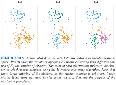
Clustering, or finding subgroups of data, is an important technique in biostatistics, sociology, neuroscience, and dowsing, allowing one to condense what would be a series of complex interaction terms into a straightforward visualization of which observations tend to cluster together. The following graph, taken from the online Introduction to Statistical Learning in R (ISLR), shows this in a two-dimensional space with a random scattering of observations:
Different colors denote different groups, and the number of groups can be decided by the researcher before performing the k-means clustering algorithm. To visualize how these groups are being formed, imagine an "X" being drawn in the center of mass of each cluster; also known as a centroid, this can be thought of as exerting a gravitational pull on nearby data points - those closer to that centroid will "belong" to that cluster, while other data points will be classified as belonging to the other clusters they are closer to.
This can be applied to FMRI data, where several different columns of data extracted from an ROI, representing different regressors, can be assigned to different categories. If, for example, we are looking for only two distinct clusters and we have several different regressors, then a voxel showing high values for half of the regressors but low values for the other regressors may be assigned to cluster 1, while a voxel showing the opposite pattern would be assigned to cluster 2. The label itself is arbitrary, and is interpreted by the researcher.
To do this in Matlab, all you need is a matrix with data values from your regressors extracted from an ROI (or the whole brain, if you want to expand your search). This is then fed into the kmeans function, which takes as arguments the matrix and the number of clusters you wish to partition it into; for example, kmeans(your_matrix, 3).
This will return a vector of numbers classifying a particular row (i.e., a voxel) as belonging to one of the specified clusters. This vector can then be prefixed to a matrix of the x-, y-, and z-coordinates of your search space, and then written into an image for visualizing the results.
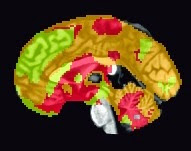
There are a couple of scripts to help out with this: One, createBlankNIFTI.m, which will erase a standardized space image (I suggest a mask output by SPM at its second level) and replace every voxel with zeros, and the other script, createNIFTI.m, will fill in those voxels with your cluster numbers. You should see something like the following (here, I am visualizing it in the AFNI viewer, since it automatically colors in different numbers):
Sample k-means analysis with k=3 clusters.
The functions are pasted below, as well as a couple of explanatory videos.
function createBlankNIFTI(imageFile)

%Note: Make sure that the image is a copy, and retain the original

X = spm_read_vols(spm_vol(imageFile));
X(:,:,:) = 0;
spm_write_vol(spm_vol(imageFile), X);
=================================
function createNIFTI(imageFile, textFile)


hdr = spm_vol(imageFile);
img = spm_read_vols(hdr);

fid = fopen(textFile);
nrows = numel(cell2mat(textscan(fid,'%1c%*[^\n]')));
fclose(fid);

fid = 0;


for i = 1:nrows
    if fid == 0
        fid = fopen(textFile);
    end

    Z = fscanf(fid, '%g', 4);

    img(Z(2), Z(3), Z(4)) = Z(1);
    spm_write_vol(hdr, img);
end
Due to the extraordinary popularity of the leave-one-subject-out (LOSO) post I wrote a couple of years ago, and seeing as how I've been using it lately and want to remember how to do it, here is a short eight-minute video on how to do it in SPM. While the method itself is straightforward enough to follow - GLMs are estimated for each group of subjects excluding one subject, and then estimates are extracted from the resulting ROIs for just that subject - the major difficulty is batching it, especially if there are many subjects.
Unfortunately I haven't been able to figure this out satisfactorily; the only advice I can give is that once you have a script that can run your second-level analysis, loop over it while leaving out consecutive subjects for each GLM. This will leave you with the same number of second-level GLMs as there are subjects, and each of these can be used to load up contrasts and observe the resulting clusters from that analysis. Then you extract data from your ROIs for that subject which was left out for the GLM and build up a vector of datapoints for each subject from each GLM, and do t-tests on it, put chocolate sauce on it, eat it, whatever you want. Seriously. Don't tell me I'm the only one who's thought of this.
Once you have your second-level GLM for each subject, I recommend using the following set of commands to get that subject's unbiased data (I feel slightly ridiculous just writing that: "unbiased data"; as though the data gives a rip about anything one way or the other, aside from maybe wanting to be left alone, and just hang out with its friends):
1. Load up your contrast, selecting your uncorrected p-value and cluster size;
2. Click on your ROI and highlight the corresponding coordinates in the Results windown;
3. Find out what the path is to the contrasts for each subject for that second-level contrast by typing "SPM.xY.P"; that will be the template you will alter to get the single subject's data - for example, "/data/myStudy/subject_101/con_0001.img" - and then you can save this to a variable, such as "subject_101_contrast";
4. Average that subject's data across the unbiased ROI (there it is again! I can't get away from it) using something like "mean(spm_get_data(subject_101_contrast, xSPM.XYZ), 2)";
5. Save the resulting value to a vector, and update this for each additional subject.
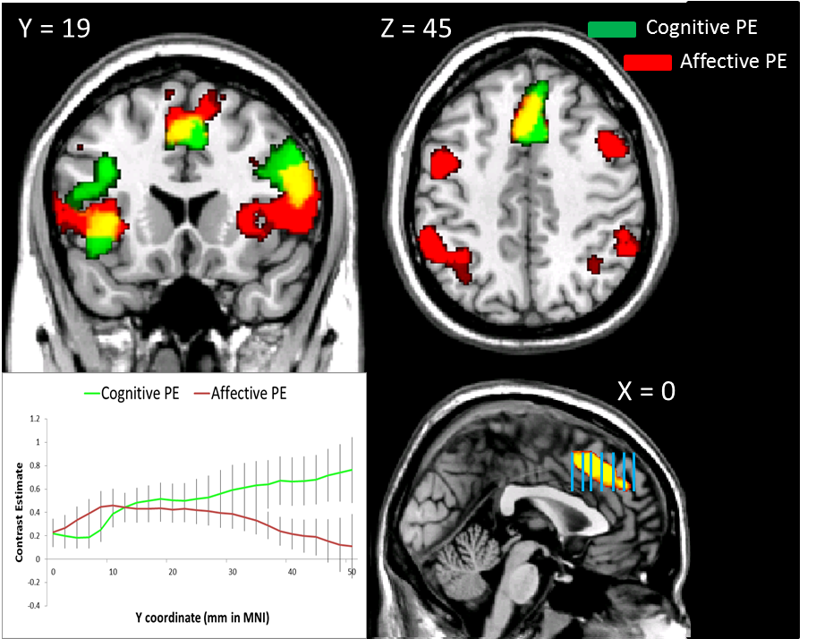
Slice analysis is a simple procedure - first you take a jar of peanut butter and a jar of Nutella, and then use a spoon to take some Nutella and then use the same spoon to mix it with the peanut butter. Eat and repeat until you go into insulin shock, and then...
No, wait! I was describing my midnight snack. The actual slice analysis method, although less delicious, is infinitely more helpful in determining regional dissociations of activity, as well as avoiding diabetes. (Although who says they can't both be done at the same time?)
The first step is to extract contrast estimates for each slice from a region of interest (ROI, also pronounced "ROY") and then average across all the voxels in that slice for the subject. Of course, there is no way you would be able to do this step on your own, so we need to copy someone else's code from the Internet and adapt it to our needs; one of John Ashburner's code snippets (#23, found here) is a good template to start with. Here is my adaptation:
rootdir = '/data/drill/space10/PainStudy/fmri/'; %Change these to reflect your directory structure glmdir = '/RESULTS/model_RTreg/'; %Path to SPM.mat and mask files subjects = [202:209 211:215 217 219 220:222 224:227 229 230 232 233]; %subjects = 202:203; Conditions.names = {'stroopSurpriseConStats', 'painSurpriseConStats'}; %Replace with your own conditions Masks = {'stroopSurpriseMask.img', 'painSurpriseMask.img'}; %Replace with your own masks; should be the product of a binary ROI multiplied by your contrast of interest Conditions.Contrasts = {'', ''}; ConStats = []; Condition1 = []; Condition2 = []; for i=subjects cd([rootdir num2str(i) glmdir]) outputPath = [rootdir num2str(i) glmdir]; %Should contain both SPM.mat file and mask files for maskIdx = 1:length(Masks) P = [outputPath Masks{(maskIdx)}]; V=spm_vol(P); tmp2 = []; [x,y,z] = ndgrid(1:V.dim(1),1:V.dim(2),0); for i=1:V.dim(3), z = z + 1; tmp = spm_sample_vol(V,x,y,z,0); msk = find(tmp~=0 & isfinite(tmp)); if ~isempty(msk), tmp = tmp(msk); xyz1=[x(msk)'; y(msk)'; z(msk)'; ones(1,length(msk))]; xyzt=V.mat(1:3,:)*xyz1; for j=1:length(tmp), tmp2 = [tmp2; xyzt(1,j), xyzt(2,j), xyzt(3,j), tmp(j)]; end; end; end;
xyzStats = sortrows(tmp2,2); %Sort relative to second column (Y column); 1 = X, 3 = Z minY = min(xyzStats(:,2)); maxY = max(xyzStats(:,2)); ConStats = [];
for idx = minY:2:maxY x = find(xyzStats(:,2)==idx); %Go in increments of 2, since most images are warped to this dimension; however, change if resolution is different ConStats = [ConStats; mean(xyzStats(min(x):max(x),4))]; end
if maskIdx == 1 Condition1 = [ConStats Condition1]; elseif maskIdx == 2 Condition2 = [ConStats Condition2]; end end end Conditions.Contrasts{1} = Condition1; Conditions.Contrasts{2} = Condition2;
This script assumes that there are only two conditions; more can be added, but care should be taken to reflect this, especially with the if/else statement near the end of the script. I could refine it to work with any amount of conditions, but that would require effort and talent.
Once these contrasts are loaded into your structure, you can then put them in an Excel spreadsheet or any other program that will allow you to format and save the contrasts in a tab-delimited text format. The goal is to prepare them for analysis in R, where you can test for main effects and interactions across the ROI for your contrasts. In Excel, I like to format it in the following four-column format:
And so on, depending on how many subjects, conditions, and slices you have. (Note here that I have position in millimeters from the origin in the y-direction; this will depend on your standardized space resolution, which in this case is 2mm per slice.)
Once you export that to a tab-delimited text file, you can then read it into R and analyze it with code like the following: