fMRI Power Analysis with NeuroPower


One of my biggest peeves is complaints about how power analyses are too hard. I often hear things like "I don't have the time," or "I don't know how to use Matlab," or "I'm being held captive in the MRI control room by a deranged physicist who thinks he is taking orders from the Quench button."

Well, Mr. Whiny-Pants, it's time to stop making excuses - a new tool called NeuroPower lets you do power analyses quickly and easily, right from your web browser. The steps are simple: Upload a result from your pilot study, enter a few parameters - sample size, correction threshold, credit card number - and, if you listen closely, you can hear the electricity of the Internet go booyakasha as it finishes your power analysis. Also, if a few days later you notice some odd charges on your credit card statement, I know nothing about that.

The following video will help you use NeuroPower and will answer all of your questions about power analysis, including:

  • What is a power analysis?
  • Why should I do a power analysis?
  • Why shouldn't I do a power analysis on a full dataset I already collected?
  • How much money did you spend at Home Depot to set up the lighting for your videos?
  • What's up with the ducks? "Quack cocaine"? Seriously?

All this, and more, now in 1080p. Click the full screen button for the full report.


Mumford & Stats: Up Your Neuroscience Game


Jeanette Mumford, furious at the lack of accessible tutorials on neuroimaging statistics, has created her own Tumblr to distribute her knowledge to the masses.

I find examples like these heartening; researchers and statisticians providing help to newcomers and veterans of all stripes. Listservs, while useful, often suffer from poorly worded questions, opaque responses, and overspecificity - the issues are individual, and so are the answers, which go together like highly specific shapes of toast in a specialized toaster.* Tutorials like Mumford's are more like pancake batter spread out over a griddle, covering a wide area and seeping into the drip pans of understanding, while being sprinkled with chocolate chips of insight, lightly buttered with good humor, and drizzled with the maple syrup of kindness.

I also find tutorials like these useful because - let's admit it - we're all slightly stupid when it comes to statistics. Have you ever tried explaining it to your dad, and ended up feeling like a fool? Clearly, we need all the help we can get. If you've ever had to doublecheck why, for example, a t-test works the way it does, or brush up on how contrast weights are made, this website is for you. (People who never had to suffer to understand statistics, on the other hand, just like people who don't have any problems writing, are disgusting and should be avoided.)

Jeanette has thirty-two videos covering the basics of statistics and their application to neuroimaging data, a compression of one of her semester-long fMRI data courses which should be required viewing for any neophyte. More recent postings report on developments and concerns in neuroimaging methods, such as collinearity, orthogonalization, nonparametric thresholding, and whether you should date fellow graduate students in your cohort. (I actually haven't read all of the posts that closely, but I'm assuming that something that important is probably in there somewhere.) And, unlike myself, she doesn't make false promises and she posts regularly; you get to stay current on what's hot, what's not, and, possibly, you can begin to make sense of those knotty methods sections. At least you'll begin to make some sense of the gibberish your advisor mutters in your general direction the next time he wants you to do a new analysis on the default pancake network - the network of regions that is activated in response to a contrast of pancakes versus waffles, since they are matched on everything but texture.**

It is efforts such as this that make the universe of neuroimaging, if not less complex, at least more comprehensible, less bewildering; more approachable, less terrifying. And any effort like that deserves its due measure of praise and pancakes.


*It was only after writing this that I realized you put bread into a toaster - toast is what comes out - but I decided to just own it.

**Do not steal this study idea from me.

Conjunction Analysis in AFNI


New Haven may have its peccadillos, as do all large cities - drug dealers, panderers, murder-suicides in my apartment complex, dismemberments near the train station, and - most unsettling of all - very un-Midwestern-like rudeness at the UPS Store - but at least the drivers are insane. Possibly this is a kind of mutually assured destruction pact they have with the pedestrians, who are also insane, and as long as everybody acts chaotically enough, some kind of equilibrium is reached. Maybe.

What I'm trying to say, to tie this in with the theme of the blog, is that conjunction analyses in FMRI allow you to determine whether a voxel or group of voxels passes a statistical threshold for two or more contrasts. You could in theory have as many contrasts as you want - there is no limit to the amount and complexity of analyses that researchers will do, which the less-enlightened would call deranged and obsessive, but which those who know better would label creative and unbridled.

In any case, let's start with the most basic case - a conjunction analysis of two contrasts. If we have one statistical map for Contrast A and another map for Contrast B, we could ask whether there are any voxels common to both A and B. First, we have to ask ourselves, "Why are we in academia?" Once we have caused ourselves enough stress and anxiety asking the question, we are then in the proper frame of mind to move on to the next question, which is, "Which voxels pass a statistical threshold for both contrasts?" You can get a sense of which voxels will show up in the conjunction analysis by simply looking at both contrasts in isolation; in this case, thresholding each by a voxel-wise p-corrected value of 0.01:


Contrast 1

Contrast 2

Conjunction

Note that the heaviest degree of overlap, here around the DLPFC region, is what passes the conjunction analysis.

Assuming that we set a voxel-wise uncorrected threshold of p=0.01, we would have the following code to generate the conjunction map:

3dcalc -prefix conjunction_map -a contrast1 -b contrast2 -expr 'step(a-2.668) + 2*step(b-2.668)'


All you need to fill in is the corresponding contrast maps, as well as your own t-statistic threshold. This will change as a result of the number of subjects in your analysis, but should be relatively stable for large numbers of subjects. When looking at the resulting conjunction map, in this case, you would have three values (or "colors") painted onto the brain: 1 (where contrast 1 passes the threshold), 2 (where contrast 2 passes the threshold), and 3 (where both pass the threshold). You can manipulate the slider bar so that only the number 3 shows, and then use that as a figure for the conjunction analysis.


For more than two contrasts

If you have more than two contrasts you are testing for a conjunction, then modify the above code to include a third map (with the -c option), and multiply the next step function by 4, always going up by a power of 2 as you increase the number of contrasts. For example, with four contrasts:

3dcalc -prefix conjunction_map -a contrast1 -b contrast2 -c contrast 3 -d contrast4 -expr 'step(a-2.668) + 2*step(b-2.668) + 4*step(c-2.668) + 8*step(d-2.668)'


Why is it to the power of 2?

I'll punt on this one and direct you to Gang Chen's page, which has all the information you want, expressed mathematics-style.


Exercises

1. Open up your own AFNI viewer, select two contrasts that you are interested in conjoining, and select an uncorrected p-threshold of 0.05. What would this change in the code above? Why?

2. Imagine the following completely unrealistic scenario: Your adviser is insane, and wants you to do a conjunction analysis of 7 contrasts, which he will probably forget about as soon as you run it. Use the same T-threshold in the code snippet above. How would you write this out?

3. Should you leave your adviser? Why or why not? Create an acrostic spelling out your adviser's name, and use the first letter on each line to spell out a good or bad attribute. Do you have more negative than positive words? What does this tell you about your relationship?

Bayesian Inference, Step 1: Installing JAGS On Your Machine

Common complaint: "Bayesian analysis is too hard! Also, I have kidney stones."
Solution: Make Bayesian analysis accessible and efficient through freeware that anyone can use!

These days, advances in technology, computers, and lithotripsy have made Bayesian analysis easy to implement on any personal computer. All it requires is a couple of programs and a library of scripts to run the actual process of Bayesian inference; all that needs to be supplied by you, the user, is the data you have collected. Conceptually, this is no more difficult then entering in data into SAS or SPSS, and, I would argue, is easier in practice.

This can be done in R, statistical software that can interface with a variety of user-created packages. You can download one such package, JAGS, to do the MCMC sampling for building up distributions of parameter estimates, and then use those parameter estimates to brag to your friends about how you've "Gone Bayes."

All of the software and steps you need to install R, JAGS, and rjags (a program allowing JAGS to talk to R) can be found on John Kruschke's website here. Once you have that, it's simply a matter of entering in your own data, and letting the program do the nitty-gritty for you.


Stats Videos

Over the past semester, I have been using online tutorials as a supplement for my Introductory Statistics course. Partly to share my knowledge with the rest of the world, partly to deflect any questions from students by asking "Well, did you watch the video yet?" While there is the possibility that such easy access to statistical concepts may reinforce truancy, absenteeism, and sloth, as well as fostering society's increasingly pathological dependence on technology, I try to be a bit more sanguine, thinking that it will serve as a useful tool for learning and memorization.

One reason behind making these is to make sure that I actually understand the concepts; another reason is to provide a reusable source of statistics material for students who do not fully grasp everything in one class sitting (and who does?); and yet another reason is to show off my wardrobe. (Hint: I rotate about two, maybe three shirts. You can see where my priorities are.)


What is Percent Signal Change? And Why are People Afraid of It?

A few years ago when I was writing up my first publication, I was gently reprimanded by a postdoc for creating a figure showing my results in percent signal change. After boxing my ears and cuffing me across the pate, he exhorted me to never do that again; his tone was much the same as parents telling their wayward daughters, recently dishonored, to never again darken their door.

Years later, I am beginning to understand the reason for his outburst; much of the time what we speak of as percent signal change, really isn't. All of the major neuroimaging analysis packages scale the data to compare signal across sessions and subjects, but expressing it in terms of percent signal change can be at best misleading, at worst fatal.

Why, then, was I compelled to change my figure to parameter estimates? Because what we usually report are the beta weights themselves, which are not synonymous with percent signal change. When we estimate a beta weight, we are looking at the amount of scaling to best match a canonical BOLD response to the raw data; a better approximation of true percent signal change would be the fitted response, and not the beta weight itself.


Even then, percent signal change is not always appropriate: recall the term "global scaling." This means comparing signal at each voxel against a baseline average of signal taken from the entire brain; this does not take into consideration intrinsic signal differences between, say, white and grey matter, or other tissue classes that one may encounter in the wilderness of those few cubic centimeters within your skull.

You can calculate more accurate percent signal change; see Gläscher (2009), or the MarsBar documentation.

Not everybody should analyze FMRI data; but if they cannot contain, it is better for one to be like me, and report parameter estimates, than to report spurious percent signal change, and burn.

The Will to (FMRI) Power

Power is like the sun: Everybody wants it, everybody finds in it a pleasant burning sensation, and yet nobody really knows what it is or how to get more of it. In my introductory statistics courses, this was the one concept - in addition to a few other small things, like standard error, effect size, sampling distributions, t-tests, and ANOVAs - that I completely failed to comprehend. Back then, I spoke as a child, I understood like a child, I reasoned like a child; but then I grew older, and I put away childish things, and resolved to learn once and for all what power really was.

1. What is Power?

The textbook definition of statistical power is rejecting the null hypothesis when it is, in fact, false; and everyone has a vague sense that, as the number of subjects increases, power increases as well. But why is this so?

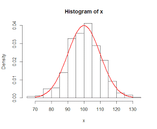
To illustrate the concept of power, consider two partially overlapping distributions, shown in blue and red:


The blue distribution is the null distribution, stating that there is no effect, or difference; the red distribution, on the other hand, represents the alternative hypothesis that there is some effect or difference. The red dashed line represents our rejection region, beyond which we would reject the null hypothesis; and we can see that the more density of the alternative distribution that lies outside of this cutoff region, the greater probability we have of randomly drawing a sample that leads to a rejection of the null hypothesis, and therefore the greater our statistical power.

However, the sticking point is this: How do we determine where to place our alternative distribution? Potentially, it could be anywhere. So how do we decide where to put it?

One approach is to make an educated guess; and there is nothing wrong with this approach, given that it is solidly based on theory, and this may be appropriate if you do not have the time or resources to run an adequate pilot sample to do a power calculation. Another approach may be to estimate the mean of the alternative distribution based on the results from other studies; but, assuming that those results were significant, they have a greater probability of being sampled from the upper tail of the alternative distribution, and therefore have a larger probability of being greater than the true mean of the alternative distribution.

A third approach is to estimate the mean of the alternative distribution based on a sample - which is the logic behind doing a pilot study. This is often the best estimate we can make of the alternative distribution, and, given that you have the time and resources to carry out such a pilot study, is the best option for estimating power.

Once the mean of the alternative distribution has been established, the next step is to determine how power can be affected by changing the sample size. Recall that the standard error, or standard deviation of your sampling distribution of means, is inversely related to the square root of the number of subjects in your sample; and, critically, that the standard error is assumed to be the same for both the null distribution and the alternative distribution. Thus, increasing the sample size leads to a reduction in the spread of both distributions, which in turn leads to less overlap between the two distributions and again increases power.

Result of increasing the sample size from 4 to 10. Note that there is now less overlap between the distributions, and that more of the alternative distribution now lies to the right of the cutoff threshold, increasing power.


2. Power applied to FMRI

This becomes an even trickier issue when dealing with neuroimaging data, when gathering a large number of pilot subjects can be prohibitively expensive, and the funding of grants depends on reasonable estimates from a power analysis.

Fortunately, a tool called fmripower allows the researcher to calculate power estimates for a range of potential future subjects, given a small pilot sample. The interface is clean, straightforward, and easy to use, and the results are useful not only for grant purposes, but also for a sanity check of whether your effect will have enough power to warrant going through with a full research study. If achieving power of about 80% requires seventy or eighty subjects, you may want to rethink your experiment, and possibly collect another pilot sample that includes more trials of interest or a more powerful design.

A few caveats about using fmripower:

  1. This tool should not be used for post-hoc power analyses; that is, calculating the power associated with a sample or full dataset that you already collected. This type of analysis is uninformative (since we cannot say with any certainty whether our result came from the null distribution or a specific alternative distribution), and can be misleading (see Hoenig & Heisey, 2001).
  2. fmripower uses a default atlas when calculating power estimates, which parcellates cortical and subcortical regions into dozens of smaller regions of interest (ROIs). While this is useful for visualization and learning purposes, it is not recommended to use every single ROI; unless, of course, you correct for the number of ROIs used by applying a method such as Bonferroni correction (e.g., dividing your Type I error rate by the number of ROIs used).
  3. When selecting an ROI, make sure that it is independent (cf. Kriegeskorte, 2009). This means choosing an ROI based on either anatomical landmarks or atlases, or from an independent contrast (i.e., a contrast that does not share any variance or correlate with your contrast of interest). Basing your ROI on your pilot study's contrast of interest - that is, the same contrast that you will examine in your full study - will bias your power estimate, since any effect leading to significant activation in a small pilot sample will necessarily be very large.
  4. For your final study, do not include your pilot sample, as this can lead to an inflated Type I error rate (Mumford, 2012). A sample should be used for power estimates only; it should not be included in the final analysis. 

Once you've experimented around with fmripower and gotten used to its interface, either with SPM or FSL, simply load up your group-level analysis (either FSL's cope.feat directory and corresponding cope.nii.gz file for the contrast of interest, or SPM's .mat file containing the contrasts in that second-level analysis), choose an unbiased ROI, your Type I error rate, and whether you want to estimate power for a specific subject number or across a range of subjects. I find the range much more useful, as it gives you an idea of the sweet spot between the number of subjects and power estimate.

Thanks to Jeanette Mumford, whose obsession with power is an inspiration to us all.


How to Fake Data and Get Tons of Money: Part 1

In what I hope will become a long-running serial, today we will discuss how you can prevaricate, dissemble, equivocate, and in general become as slippery as an eel slathered with axle grease, yet still maintain your mediocre, ill-deserved, but unblemished reputation, without feeling like a repulsive stain on the undergarments of the universe.

I am, of course, talking about making stuff up.

As the human imagination is one of the most wonderful and powerful aspects of our nature, there is no reason you should not exercise it to the best of your ability; and there is no greater opportunity to use this faculty than when the stakes are dire, the potential losses abysmally, wretchedly low, the potential gains dizzyingly, intoxicatingly high. (To get yourself in the right frame of mind, I recommend Dostoyevsky's novella The Gambler.) And I can think of no greater stakes than in reporting scientific data, when entire grants can turn on just one analysis, one result, one number. Every person, at one time or another, has been tempted to cheat and swindle their way to fortune; and as all are equally disposed to sin, all are equally guilty.

In order to earn your fortune, therefore, and to elicit the admiration, envy, and insensate jealousy of your colleagues, I humbly suggest using none other than the lowly correlation. Taught in every introductory statistics class, a correlation is simply a quantitative description of the association between two variables; it can range between -1 and +1; and the farther away from zero, the stronger the correlation, while the closer to zero, the weaker the correlation. However, the beauty of correlation is that one number - just one! - has the inordinate ability to make the correlation significant or not significant.Take, for example, the correlation between shoe size and IQ. Most would intuit that there is no relationship between the two, and that having a larger shoe size should neither be associated with a higher IQ or a lower IQ. However, if Bozo the Clown is included in your sample - a man with a gigantic shoe size, and who happens to also be a comedic genius - then your correlation could be spuriously driven upward by this one observation.

To illustrate just how easy this is, a recently created web applet provides you with fourteen randomly generated numbers, and allows the user to plot an additional point anywhere on the graph. As you will soon learn, it is simple to place the observation in a reasonable and semi-random location, and get the result that you want:

Non-significant correlation, leading to despair, despond, and death.

Significant correlation, leading to elation, ebullience, and aphrodisia.

The beauty of this approach lies in its simplicity: We are only altering one number, after all, and this hardly approaches the enormity of scientific fraud perpetrated on far grander scales. It is easy, efficient, and fiendishly inconspicuous, and should anyone's suspicions be aroused, that one number can simply be dismissed as a clerical error, fat-finger typing, or simply chalked up to plain carelessness. In any case, it requires a minimum of effort, promises a maximum of return, and allows you to cover your tracks like the vulpine, versatile genius that you are.

And should your conscience, in your most private moments, ever raise objection to your spineless behavior, merely repeat this mantra to smother it: Others have done worse.

The Central Limit Theorem: Part 1

Random sample of numbers from a normal distribution, N ~ (100, 10). Actual normal distribution is superimposed in red.


One fundamental concept for hypothesis testing is something called the Central Limit Theorem. This theorem states that, for large enough sample sizes and for enough samples, we begin to build a sampling distribution that is approximately normal. More importantly, when we build sampling distributions of the means selected from a population, the average mean is identical to the mean of the parent population.

To illustrate this in R, from the parent population we can take random samples of several different sizes - 10, 50, 300 - and plot those samples as a histogram. These samples will roughly follow the shape of the population they were drawn from - in this case, the normal distribution with a mean of 100 and a standard deviation of 10 - and the more observations we have in our sample, the more closely it reflects the actual parent population. Theoretically, if our sample were large enough, it would in essence sample the entire population and therefore be the same as the population.

However, for smaller sample sizes, we can calculate the mean of each sample and then plot that value in a histogram. If we do this enough times, the mean of the sampling distribution has less spread and more tightly clusters around the mean of the parent population. Increasing the sample size does the same thing.

The demo script can be downloaded here; I have basically copied the code from this website, but distilled it into an R script that can be used and modified by anybody.


Brief Overview of Standard Error

As I begin teaching a statistics course next semester, I've been spending the past couple of weeks hitting the books and refreshing my statistical knowledge; however, to my dismay, I remember virtually nothing of what was taught during my salad days of college, when my greatest concern was how fast I could run eight kilometers, and whether there would be enough ice cream left over in the Burton Dining Hall after a late workout. You laugh now, but during certain eras of one's lifetime, there are specific things that take on especial significance, only to be later ridiculed or belittled; as what is important to an adult may seem insignificant to a child, whereas what is a matter of life and death for the child may seem silly to the adult, even though there is, deep down, recognition of the same hopes and fears, the child the father of the man.

In any case, imagine my sphincter-tightening (and subsequent releasing) horror when I realized how little I actually knew, and with what haste I began to relearn the fundamentals; not only in statistics, but in several other related fields, such as biology, physics, eschatology, chemistry, and astrology, which are needed to have any sense about what one is doing when analyzing neuroimaging data. It is one thing to bandy about the usual formulas and fill them in as needed; it is completely another to learn enough jargon so that, even if you still do not understand it, you can use enough impressive-sounding words to allay any fears that you are hopelessly, utterly ignorant. And this, I maintain, is the end of all good education.

I leave you with one of the most famous quotes about the value of education, from George Washington's second inaugural address:

Power flows to the one who knows how. Desire alone is not enough.

More details about standard error can be found in the following video, which features a legit, squeaking chalkboard.